


Google Refreshes Its Logo: A New Look for the First Time in Ten Years
Google has unveiled its newly updated logo for the first time in ten years, marking a significant change in its brand identity. Read on to learn about the exciting updates, the design choices, and what this means for Google's future.
Google Refreshes Its Logo: A New Look for the First Time in Ten Years
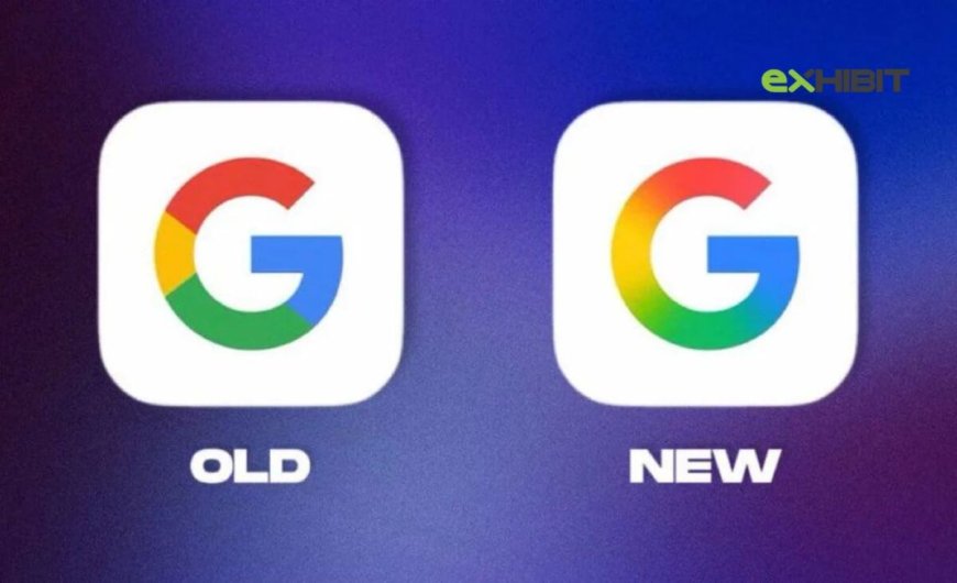
After a decade of using the same iconic ‘G’ logo, Google has made a major shift by unveiling a refreshed logo. The new logo design, which was revealed in 2025, marks the first update to its branding in ten years. Over the years, Google’s logo has become one of the most recognized symbols globally, reflecting the company’s growth, its focus on simplicity, and its tech-forward approach. This change represents not only a visual update but also a strategic move to reflect the company’s evolving identity in the fast-paced digital age.
In this article, we will explore the key elements of Google's new logo, what it represents, the design changes, and why this update is so significant for the company and its brand.
1. A Bold New Look: Why Google Changed Its Logo
For ten years, Google’s logo remained untouched, offering a sense of consistency and familiarity to users. But as the digital world changes, so do the needs of global companies. Google’s recent logo change comes at a time when the company continues to expand into new services and markets.
-
Adapting to New Platforms: One of the primary reasons for this redesign is Google's shift toward a multi-platform world. With more people accessing Google through smartphones, tablets, and wearables, the updated logo had to be optimized for various screen sizes and device formats. The new design reflects this modern, mobile-first approach.
-
Consistency Across Devices: Google has diversified its services and products, including smart speakers, cloud computing, self-driving cars, and more. The new logo allows for better brand consistency across all these products and makes it easier to scale across platforms, ensuring it’s easily recognizable no matter where it’s displayed.
-
Reflecting Company Evolution: In the last decade, Google has changed dramatically. Its focus has shifted from being primarily a search engine to being a leader in artificial intelligence, cloud computing, hardware development, and even autonomous driving. The updated logo symbolizes Google’s expanded role in a rapidly changing technological landscape.
2. Key Features of the New Google Logo Design
The updated Google logo has undergone a few noticeable changes that are designed to modernize its look while staying true to its roots. Let’s break down the key elements of the new logo design:
-
Sleeker Typeface: The new logo uses a more simplified and rounded typeface, giving it a friendlier and more approachable feel. While the previous logo was elegant and professional, the new one has a contemporary, soft aesthetic that suits the current tech culture.
-
Bold and Simplified Colors: The iconic primary colors—blue, red, yellow, and green—remain but are now cleaner and brighter. The colors are a bit more vibrant, giving the logo a fresh, energizing look. This change is designed to make the logo stand out more on digital screens, ensuring it grabs attention in a world filled with information overload.
-
Flat Design for Digital Use: The flat design trend is evident in the updated logo. Gone are the shadows and gradients of the older logo, replaced with a flat, clean look that performs better on various devices. The simplified flat design ensures better readability and accessibility, particularly on mobile screens.
-
No More Drop Shadow: The previous logo featured a slight drop shadow effect that made the text appear slightly raised. In the new logo, this effect has been removed to create a more modern, clean, and minimalist feel.
-
Focus on the ‘G’ Icon: While the wordmark is important, Google’s new logo also emphasizes the ‘G’ icon as a stand-alone design. The single ‘G’ is now the central element of the Google branding, appearing not just in the logo, but also in app icons and other Google products.
3. The Story Behind the New Google Logo
Google has always been a company that values simplicity and functionality. Its logo update reflects these core principles, keeping its design recognizable but also relevant for the times. The change isn’t just about aesthetics; it’s a strategic move designed to fit Google’s shifting business goals and technological landscape.
-
Reflecting a Unified Brand Vision: The change to the Google logo represents a unified vision for the future of the company. By simplifying the design and focusing on elements that are easy to identify on digital platforms, Google is aligning its visual identity with its role as a global leader in technology and innovation.
-
Design Inspiration: Google’s design team worked to create something that felt timeless, yet modern. The new font, a customized version of Google’s own proprietary typeface, was carefully crafted to ensure legibility across all platforms while maintaining a human and approachable feel. The design inspiration draws heavily from minimalist and clean design trends that dominate the digital world today.
-
A Nod to the Past: While the logo has undergone a change, it still retains the spirit of Google’s legacy. The bright, primary colors continue to embody Google’s playful and innovative identity. The new design acknowledges the company’s history while moving forward into the future with confidence.
4. Impact of the New Logo on Google’s Brand Image
The redesign of Google’s logo is expected to have several effects on the company’s overall brand image:
-
Appealing to Younger Audiences: The updated logo’s friendly, approachable design appeals to younger generations who are more likely to interact with brands via mobile apps and digital platforms. By modernizing its logo, Google is signaling that it’s in tune with current trends and technology.
-
Stronger Recognition: With a more streamlined design that’s optimized for all screen sizes, Google’s logo will be more recognizable across platforms. The simpler, cleaner design makes it easier for users to spot the logo in various contexts, from Google search to Google Assistant on smart devices.
-
Aligning with Google’s Expansion: As Google branches out into new areas like AI, hardware, and cloud services, the new logo serves as a visual cue that the company is expanding its role in the digital ecosystem. It aligns perfectly with Google’s ever-growing influence in tech and business.
-
Corporate Versatility: The logo’s new design gives Google the flexibility to adapt and evolve in the future. The logo will continue to work as the company diversifies its offerings, from autonomous vehicles to smart devices.
5. What Does This Update Mean for Google’s Future?
The update to Google’s logo is more than just a cosmetic change. It marks a significant shift in how the company wants to be perceived and how it plans to interact with its users. By embracing a more modern and simplified design, Google is setting the stage for the next chapter in its story, focusing on the following:
-
Future-Proofing: The new logo is designed to stay relevant for years to come, adjusting to the digital landscape as it continues to evolve. Google is positioning itself as a forward-thinking company, constantly adapting to the needs of its users.
-
Increased Focus on User Experience: With the emphasis on digital platforms, the new logo is part of Google’s commitment to improving user experience. Its clean and simple design will make interacting with Google products smoother, whether through search, apps, or AI-based services.
-
Innovation and Simplicity: Google’s new logo captures the essence of both innovation and simplicity, which have always been at the core of its mission. The redesign shows that the company is not only looking back on its legacy but also preparing for the challenges of tomorrow.
6. Conclusion: A New Era for Google’s Brand Identity
Google’s logo redesign marks an important moment in the company’s history. After ten years, the updated look signifies a new chapter in Google’s growth and evolution as a tech giant. The new logo is clean, modern, and designed with digital platforms in mind, reflecting Google’s commitment to innovation, simplicity, and user experience.
As the company continues to diversify and expand into new territories, the updated logo ensures that Google remains at the forefront of the digital world, recognizable and relevant to both new and old users alike. This refresh is not just a visual update but a symbol of the company’s future-focused approach, positioning Google for success in the rapidly evolving tech landscape.
What's Your Reaction?